Balsamiq AI
Most AI tools are about shipping. Balsamiq AI is about thinking. When we added AI features, the challenge was making them feel powerful without losing what makes Balsamiq, Balsamiq.
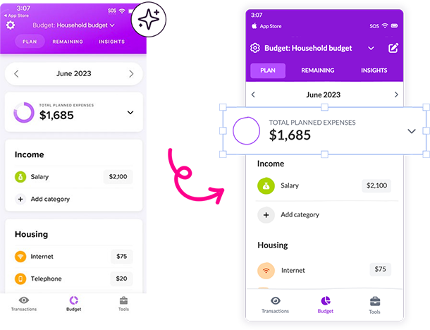 Image to Wireframe
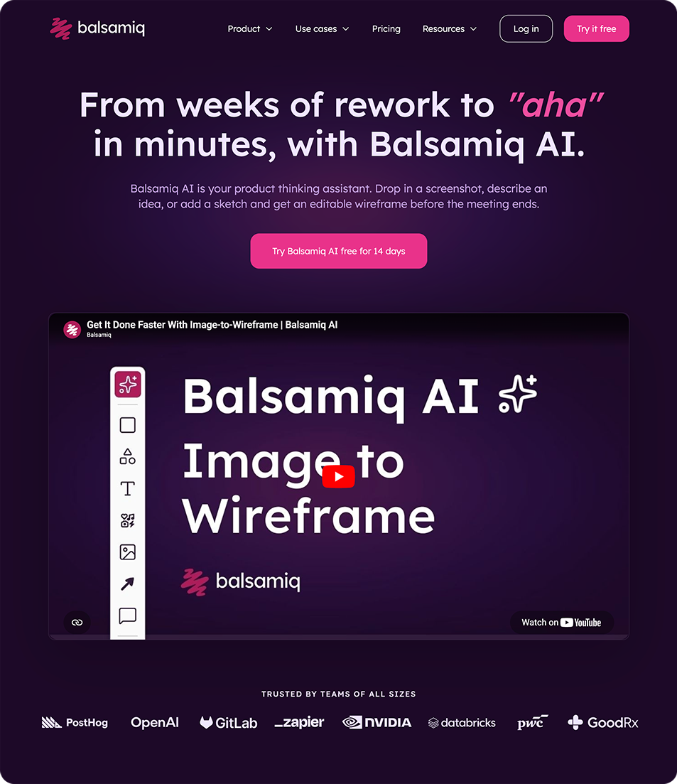 Landing page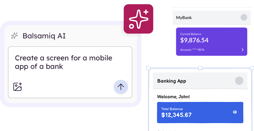

Overview
The challenge: introduce a new visual language for Balsamiq AI: a dark, differentiated treatment for AI-powered features without it feeling like a bolted-on experiment. It needed to work as a real page: responsive, accessible, and built to fit our existing design system and production pipeline, not a one-off mockup.
Visual direction
My manager and I explored a few directions together, landing on an eggplant-and-hot-pink dark theme to visually set AI features apart from Balsamiq’s usual light, friendly UI. I took that direction and built it into the shipped page: adapting spacing, type scale, and layout to match our actual design tokens and grid, and integrating it into our production codebase and deploy pipeline.
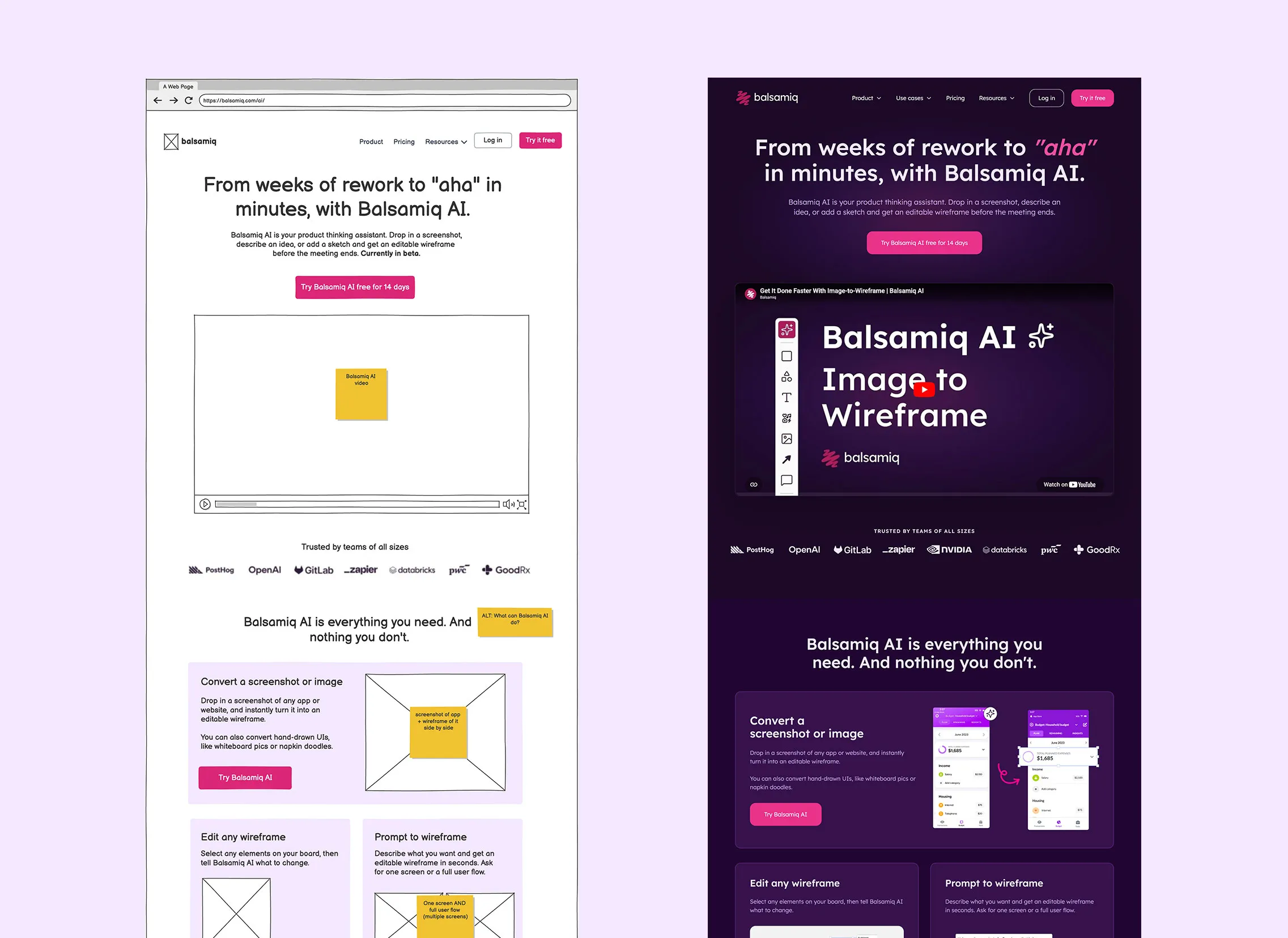
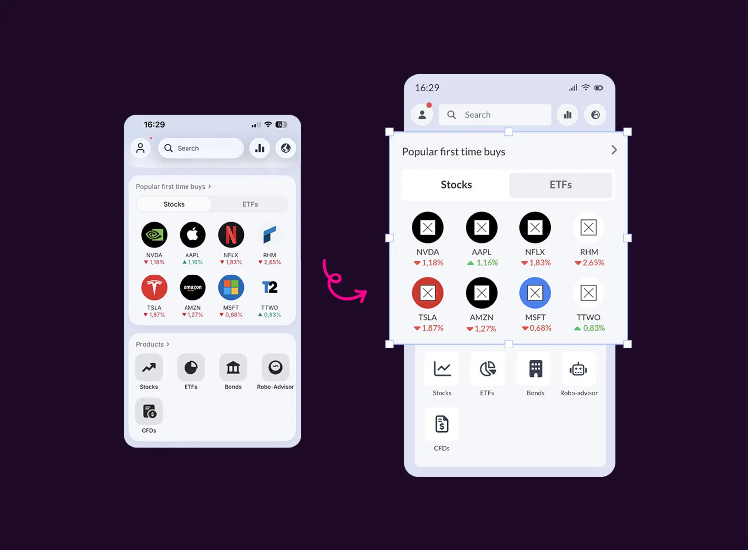
Image to Wireframe
Before/after visual: a real app screenshot next to its wireframe equivalent.
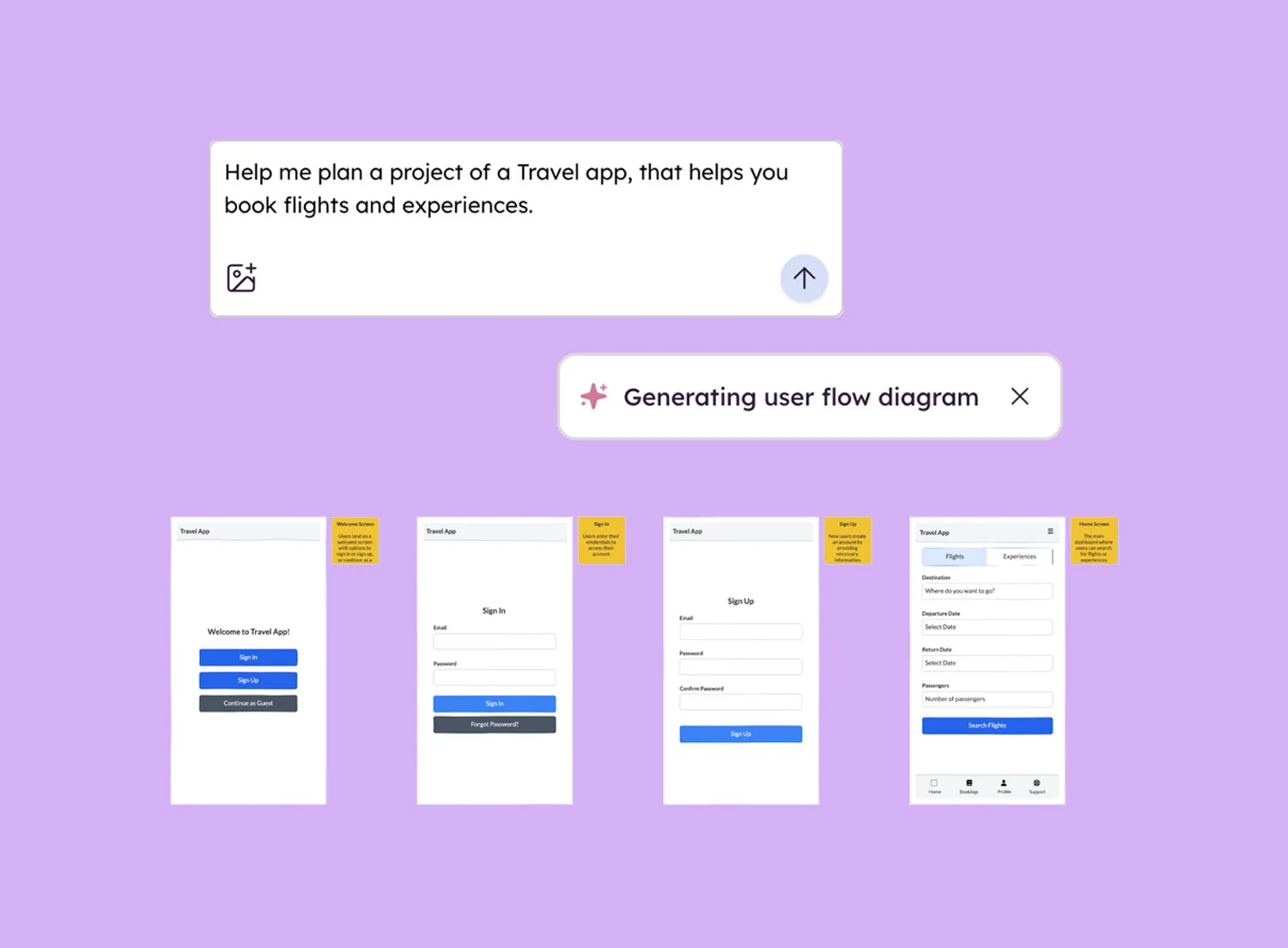
Prompt to Wireframe
Generated wireframe output to show the input→output flow at a glance.
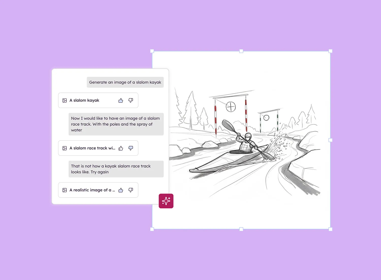
Sketch-style images
I designed the visuals for this section, keeping the aesthetic raw and hand-drawn to contrast with the polished dark UI around it.
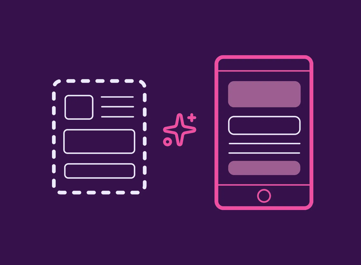
Prototypes
Prototype illustration to show a wireframe turning into a clickable flow.
Building it
I built the page in HTML/CSS, structured the content sections, and worked to make the new aesthetic cohere across every block: feature cards, trust logos, FAQ accordion, security section, and CTAs. Getting the dark theme to feel intentional, not just “inverted”, meant calibrating every shade of purple, every pink, every opacity.
The page is designed to drive a single action: start a free trial. Every section ladders up to that: here’s what it does, here’s who trusts it, here are your questions answered, now try it.